Final Report

Motivation
Running a marathon requires an immense amount of time, effort, and dedication. First-time marathon runners are forced to make decisions with little knowledge of what to expect. Being ill-prepared and over-training are two common experiences that occur during training and on race day. Emma, one of our group members, ran the New York City Marathon (NYCM) this past fall, which was her first marathon. After completing the marathon on November 6th, Emma was prepared to start training for the next one. Therefore, we are interested in understanding the impact of external factors, such as temperature, wind, elevation, etc., on Emma’s speed and performance during the marathon, while also considering how training changed over time in order to improve her training for the next marathon.
Initial Questions
For the purposes of this project, we will be answering the following questions:
- What does Emma’s training schedule look like with respect to environmental factors such as temperature, humidity, elevation, etc.?
- What are Emma’s optimal training conditions?
- What are Emma’s most comfortable training distances?
- How do environmental factors affect Emma’s performance? Are these factors good predictors for her performance?
Data
In preparation for data analysis, we will load the following libraries:
tidyverseFITfileRdplyrpatchworkleafletmodelr
library(tidyverse)
library(FITfileR)
library(dplyr)
library(patchwork)
library(leaflet)
library(modelr)
Data was collected using the Garmin Forerunner 245 activity watch
from July 23, 2020 to November 6, 2022. Collected data was uploaded to
Strava.com after each activity. After granting permission, personal data
was downloaded from Strava.com. Summary data for each activity post was
saved in the form of a .csv file (imported using
tidyverse) and per-second data for each activity was
compiled and saved in a .fit file (imported using
FITfileR).
Importing & Describing Raw Data
First, we imported the summary-level data of all of Emma’s training
runs from July 23, 2020 to November 6, 2022 using the
read_csv function.
training_raw <- read_csv("activities/activities.csv") %>%
  janitor::clean_names()
The raw data contains 335 observations and 84 variables. Variables include data regarding activity date and type, trail/route information, equipment use, physical responses to training (heart rate, cadence, etc.), and weather. As is, these data were not tidy… Let’s tidy!
Data Cleaning
After importing, the data frame was then cleaned to include
activities from the start of marathon training (April 4, 2022) to the
day of the New York City Marathon (November 6, 2022). The data was
filtered to only include observations from activity_type
that were classified as ‘Run’. We selected 22 relevant variables
(summarized below).
Due to Emma’s marathon training beginning April 4th, 2022, the
activity_id was used in order to filter any training prior
to this. Following this, the variable activity_date was
separated into two variables: the date on which the run occurred
(date) as well as the time when the run began
(time). The elapsed_time_6 variable was
converted from seconds to minutes (elapsed_time_min). In
addition to this, the variables names for distance_7,
max_heart_rate_8, and relative_effort_9 were
changed to distance_km, max_heart_rate, and
relative_effort, respectively.
A new data frame, activities_summaries was created in
order to include the written accounts from each of Emma’s runs,
including variables activity_name and
activity_description.
training_summary =
  training_raw %>%
  filter(activity_type == "Run") %>%
  select(activity_id, activity_date, activity_name, activity_description, elapsed_time_6, distance_7, max_heart_rate_8, relative_effort_9, max_speed, average_speed, elevation_gain, elevation_loss, max_grade, average_grade, max_cadence, average_cadence, average_heart_rate, calories, weather_temperature, dewpoint, humidity, wind_speed) %>%
  filter(activity_id >= 6910869137) %>%
  separate(activity_date, c("month_date", "year", "time"), sep = ", ") %>%
  mutate(
    date = str_c(month_date, year, sep = " "),
    date = as.Date(date, format = "%b%d%Y")
  ) %>%
  select(-month_date, -year) %>%
  mutate(
    elapsed_time_min = elapsed_time_6 / 60,
    distance_km = distance_7,
    max_heart_rate = max_heart_rate_8,
    relative_effort = relative_effort_9
  ) %>%
  select(-elapsed_time_6, -distance_7, -max_heart_rate_8, -relative_effort_9)

activity_summaries =
  training_summary %>%
  select(activity_id, date, time, activity_name, activity_description)

tidy_training =
  training_summary %>%
  select(-activity_name, -activity_description) %>%
  select(activity_id, date, time, distance_km, elapsed_time_min, max_speed, average_speed, max_heart_rate, average_heart_rate, relative_effort, everything()) %>%
  filter(date != "2022-03-31",
         date != "2022-04-03")
The final cleaned data set, tidy_training, included
108 observations and 21 variables. The
tidied dataset contains the following variables and associated
characteristics:
activity_id: Unique activity identifierdate: Date of activity (YYYY-MM-DD)time: Time of activitydistance_km: Distance ran (km), mean = 8.9215741elapsed_time_min: Time spent running in minutes, mean = 54.4388889max_speed: Maximum running speed (meters/second), mean = 7.4808794average_speed: Average speed (meters/second) during the activity, mean = 3.037298max_heart_rate: Maximum heart rate (beats per minute) during the activity, mean = 176.4537037average_heart_rate: Average heart rate during the activity, mean = 154.6877133relative_effort: Relative effort calculated using heart rate data, mean = 95.462963elevation_gain: Elevation gained during the activity, mean = 58.0976234elevation_loss: Elevation lost during the activity, mean = 469.7619048max_grade: Maximum grade during the activity, mean = 24.2052355average_grade: Average grade during the activity, mean = -3.0404352^{-4}max_cadence: Maximum cadence (steps per minute) during the activity, mean = 89.1296296average_cadence: Average cadence (steps per minute) during the activity, mean = 79.7518814calories: Calories burned during the activity, mean = 454.2592593weather_temperature: Temperature (Celsius) during the activity, mean = 7.4808794dewpoint: Dew point during the activity, mean = 13.614humidity: Humidity (%) during the activity, mean = 0.7151765wind_speed: Wind speed in meters per second during the activity, mean = 2.1948235
Exploratory Analysis
To first visualize Emma’s training schedule, we created a weekly mileage plot illustrating her mileage (km) ran over her training period. We then looked to investigate the optimal running length for her training sessions using a density plot, as well as assessing the relationship between temperature and average speed, average heart rate, and relative effort. We then investigated the relationship between humidity and average speed, average heart rate, and relative effort. Finally, we plotted Emma’s NYCM racing path throughout NYC, including average speed, heart rate, cadence, and altitude for each mile during the race.
Note: data only includes Emma’s logged activities - rest days were not included.
Mileage Over Time
tidy_training = tidy_training %>%
  mutate(week = as.numeric(strftime(date, format = "%V")) - 13) %>%
  group_by(week) %>%
  mutate(weekly_distance_km = sum(distance_km))

tidy_training %>%
  ggplot(aes(x = week, y = weekly_distance_km)) +
  geom_point(color = c("#FFA500")) +
  geom_line(color = c("#FFA500")) +
  labs(
    title = "Weekly Distance Ran by Emma (km)",
    x = "Week",
    y = "Distance (km)") +
  scale_x_continuous(breaks = scales::pretty_breaks(n = 5)) +
  scale_y_continuous(breaks = scales::pretty_breaks(n = 5)) +
  theme(axis.line = element_line(color = "grey"),
        panel.background = element_blank(),
        legend.position = "none",
        panel.grid.major = element_line(color = "light grey", linetype = "dashed"),
        plot.title = element_text(hjust = 0.5))
Emma’s mileage overtime gradually increased throughout her training period, peaking at Week 20 where she ran 70.28 km over the course of the week. Weeks 21-25 demonstrate a steep drop in weekly mileage. This was due to Emma’s illnesses and injuries, making her unable to run. The plot above demonstrates Emma’s ramp up in training mileage in preparation for the NYCM.
Mileage Density Plot
tidy_training %>%
  ggplot(aes(x = distance_km), color = c("#FFA500")) +
  geom_density(alpha = 0.5, fill = c("#FFA500")) +
  labs(
    title = "Density of Daily Distances Ran by Emma (km)",
    x = "Distance (km)",
    y = "Density") +
  scale_x_continuous(breaks = scales::pretty_breaks(n = 5)) +
  scale_y_continuous(breaks = scales::pretty_breaks(n = 5)) +
  theme(axis.line = element_line(color = "grey"),
        panel.background = element_blank(),
        legend.position = "none",
        panel.grid.major = element_line(color = "light grey", linetype = "dashed"),
        plot.title = element_text(hjust = 0.5))
The density plot above illustrates the mileage at which Emma run’s most often during her training period. The plot peaks at a distance of approximately 7km, indicating that 7km is the length of most of Emma’s runs during her training period.
Performance vs. Temperature
temp_avg_speed =
  tidy_training %>%
  ggplot(aes(x = weather_temperature, y = average_speed)) +
  geom_point(color = c("#FFA500")) +
  geom_smooth(se = FALSE, color = "dark grey") +
    labs(
    x = "Temperature (C)",
    y = "Average Speed (m/s)") +
  scale_x_continuous(breaks = scales::pretty_breaks(n = 5)) +
  scale_y_continuous(breaks = scales::pretty_breaks(n = 5)) +
  theme(axis.line = element_line(color = "grey"),
        panel.background = element_blank(),
        legend.position = "none",
        panel.grid.major = element_line(color = "light grey", linetype = "dashed"),
        plot.title = element_text(hjust = 0.5)) +
  ggtitle("Temperature (C) vs. Emma's Average Speed (m/s)")

temp_avg_hrt =
  tidy_training %>%
  ggplot(aes(x = weather_temperature, y = average_heart_rate)) +
  geom_point(color = c("#FFA500")) +
  geom_smooth(se = FALSE, color = "dark grey") +
    labs(
    x = "Temperature (C)",
    y = "Average Heart Rate (BPM)") +
  scale_x_continuous(breaks = scales::pretty_breaks(n = 5)) +
  scale_y_continuous(breaks = scales::pretty_breaks(n = 5)) +
  theme(axis.line = element_line(color = "grey"),
        panel.background = element_blank(),
        legend.position = "none",
        panel.grid.major = element_line(color = "light grey", linetype = "dashed"),
        plot.title = element_text(hjust = 0.5)) +
  ggtitle("Temperature (C) vs.\n Emma's Average Heart Rate (BPM)")

temp_rel_effort =
  tidy_training %>%
  ggplot(aes(x = weather_temperature, y = relative_effort)) +
  geom_point(color = c("#FFA500")) +
  geom_smooth(se = FALSE, color = "dark grey") +
    labs(
    x = "Temperature (C)",
    y = "Relative Effort") +
  scale_x_continuous(breaks = scales::pretty_breaks(n = 5)) +
  scale_y_continuous(breaks = scales::pretty_breaks(n = 5)) +
  theme(axis.line = element_line(color = "grey"),
        panel.background = element_blank(),
        legend.position = "none",
        panel.grid.major = element_line(color = "light grey", linetype = "dashed"),
        plot.title = element_text(hjust = 0.5)) +
  ggtitle("Temperature (C) vs.\n Emma's Relative Effort")

temp_avg_speed /
(temp_avg_hrt | temp_rel_effort)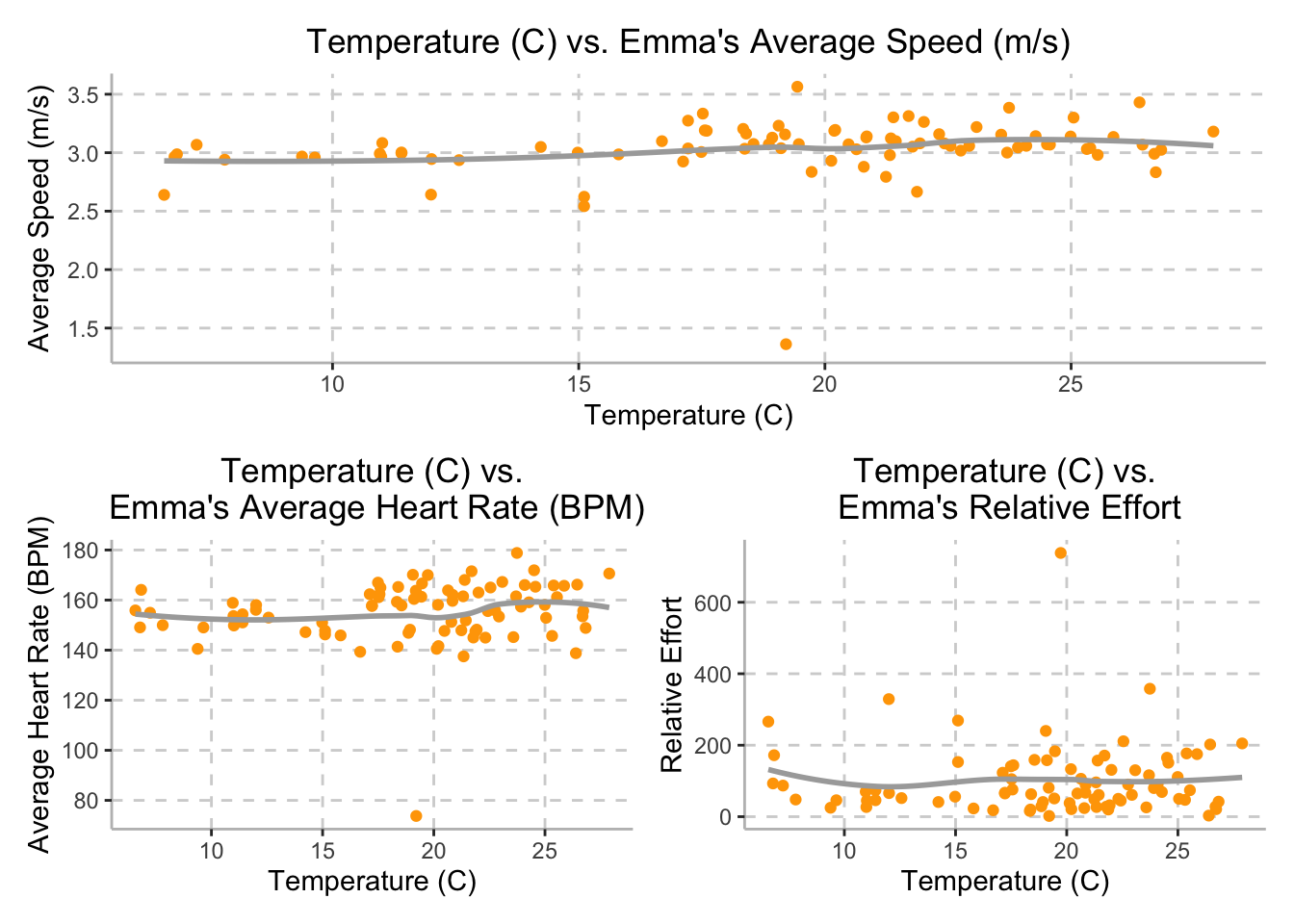
Although we expected Emma’s speed to be inversely proportional to the weather temperature, Emma’s average speed stayed approximately steady throughout the training period, with a speed of 3 meters per second (10.8 km per hour), while temperature varied between 6.58 degrees Celsius and 27.89 degrees Celsius.
Additionally, while we hypothesized that external temperature would be directly related to Emma’s average heart rate, the plot on the bottom left demonstrates that as temperature increases, there is little noticeable change in Emma’s average heart rate. Daily temperatures varied between 6.58 degrees Celsius and 27.89 degrees Celsius and Emma’s heart rate averaged around 155 beats per minute.
Finally, we also hypothesized that external temperature would be
directly related to Emma’s relative effort; however, the plot on the
bottom right demonstrates that external temperature and Emma’s relative
effort do not appear to be correlated. The variable
relative_effort is calculated by Strava and based off of
her maximum heart rate and pre-established heart rate zones. The plot
demonstrates that while temperature varied between 6.58 degrees Celsius
and 27.89 degrees Celsius, Emma’s relative effort averaged around
150.
Performance vs. Humidity
humid_avg_speed =
  tidy_training %>%
  ggplot(aes(x = humidity*100, y = average_speed)) +
  geom_point(color = c("#FFA500")) +
  geom_smooth(se = FALSE, color = "dark grey") +
    labs(
    x = "Humidity (%)",
    y = "Average Speed (m/s)") +
  scale_x_continuous(breaks = scales::pretty_breaks(n = 5)) +
  scale_y_continuous(breaks = scales::pretty_breaks(n = 5)) +
  theme(axis.line = element_line(color = "grey"),
        panel.background = element_blank(),
        legend.position = "none",
        panel.grid.major = element_line(color = "light grey", linetype = "dashed"),
        plot.title = element_text(hjust = 0.5)) +
  ggtitle("Humidity (%) vs. Emma's Average Speed (m/s)")

humid_avg_hrt =
  tidy_training %>%
  ggplot(aes(x = humidity*100, y = average_heart_rate)) +
  geom_point(color = c("#FFA500")) +
  geom_smooth(se = FALSE, color = "dark grey") +
    labs(
    x = "Humidity (%)",
    y = "Average Heart Rate (BPM)") +
  scale_x_continuous(breaks = scales::pretty_breaks(n = 5)) +
  scale_y_continuous(breaks = scales::pretty_breaks(n = 5)) +
  theme(axis.line = element_line(color = "grey"),
        panel.background = element_blank(),
        legend.position = "none",
        panel.grid.major = element_line(color = "light grey", linetype = "dashed"),
        plot.title = element_text(hjust = 0.5)) +
  ggtitle("Humidity (%) vs.\n Emma's Average Heart Rate (BPM)")

humid_rel_effort =
  tidy_training %>%
  ggplot(aes(x = humidity*100, y = relative_effort)) +
  geom_point(color = c("#FFA500")) +
  geom_smooth(se = FALSE, color = "dark grey") +
    labs(
    x = "Humidity (%)",
    y = "Relative Effort") +
  scale_x_continuous(breaks = scales::pretty_breaks(n = 5)) +
  scale_y_continuous(breaks = scales::pretty_breaks(n = 5)) +
  theme(axis.line = element_line(color = "grey"),
        panel.background = element_blank(),
        legend.position = "none",
        panel.grid.major = element_line(color = "light grey", linetype = "dashed"),
        plot.title = element_text(hjust = 0.5)) +
  ggtitle("Humidity (%) vs.\n Emma's Relative Effort")

humid_avg_speed /
(humid_avg_hrt | humid_rel_effort)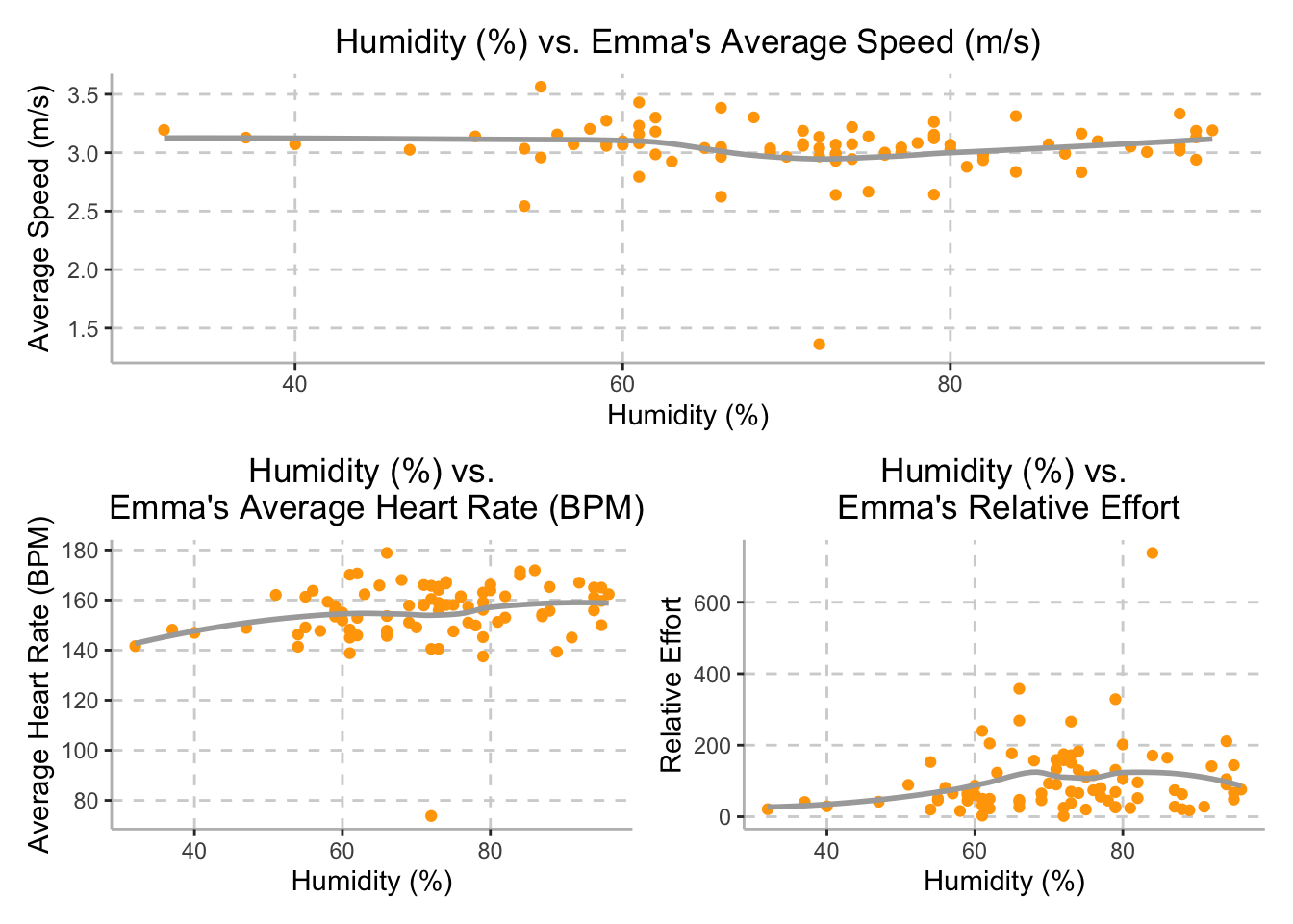
Although we expected Emma’s speed to be inversely related to the external humidity, Emma’s average speed stayed approximately steady throughout the training period, with a speed of 3 meters per second (10.8 km per hour), while humidity varied between between 32% and 96%, as demonstrated in the top plot above.
Additionally, while we hypothesized that external humidity would be directly related to Emma’s average heart rate, the plot on the bottom left demonstrates that there is a potential positive relationship between humidity and Emma’s average heart rate. Humidity varied between 32% and 96% and Emma’s average heart rate ranged between 145 to 165 beats per minute.
Finally, although we hypothesized that external humidity would be directly related to Emma’s relative effort, the plot on the bottom right demonstrates that relative effort may plateau at 150 once humidity reaches 70%; however, there is a large degree of variation in relative effort in this data set. The variable relative effort is calculated by Strava and based off of her maximum heart rate and heart rate zones during the training session. While humidity varied between 32% and 96%, Emma’s relative effort averaged around 150.
Interactive Marathon Route Map
marathon_day <- read_csv("activities/marathon_day.csv")

marathon_day =
marathon_day %>%
mutate(
  distance_m = distance*0.000621371
) %>%
mutate(group = case_when(
    between(distance_m, 0,0.9999) ~ "Start",
    between(distance_m, 1, 1.9999) ~ "1",
    between(distance_m, 2, 2.9999) ~ "2",
    between(distance_m, 3, 3.9999) ~ "3",
    between(distance_m, 4, 4.9999) ~ "4",
    between(distance_m, 5, 5.9999) ~ "5",
    between(distance_m, 6, 6.9999) ~ "6",
    between(distance_m, 7, 7.9999) ~ "7",
    between(distance_m, 8, 8.9999) ~ "8",
    between(distance_m, 9, 9.9999) ~ "9",
    between(distance_m, 10, 10.9999) ~ "10",
    between(distance_m, 11, 11.9999) ~ "11",
    between(distance_m, 12, 12.9999) ~ "12",
    between(distance_m, 13, 13.9999) ~ "13",
    between(distance_m, 14, 14.9999) ~ "14",
    between(distance_m, 15, 15.9999) ~ "15",
    between(distance_m, 16, 2.9999) ~ "16",
    between(distance_m, 17, 17.9999) ~ "17",
    between(distance_m, 18, 18.9999) ~ "18",
    between(distance_m, 19, 19.9999) ~ "19",
    between(distance_m, 20, 20.9999) ~ "20",
    between(distance_m, 21, 21.9999) ~ "21",
    between(distance_m, 22, 22.9999) ~ "22",
    between(distance_m, 23, 23.9999) ~ "23",
    between(distance_m, 24, 24.9999) ~ "24",
    between(distance_m, 25, 25.9999) ~ "25",
    between(distance_m, 26, 26.9999) ~ "26-Finish"))

#Recode
marathon_geo =
  marathon_day %>%
  mutate(
    latitude  = position_lat,
    longitude = position_long) %>%
  select(-position_lat, -position_long)

marathon_speed =
marathon_geo %>%
  group_by(group) %>%
  mutate(
    speed_mile =
  enhanced_speed*2.237)

#Aggregate Data
agg = aggregate(marathon_speed,
                by = list(marathon_geo$group),
                FUN = mean)
In order to display Emma’s progress throughout the NYC Marathon an
interactive map was created. Utilizing data from the
marathon_day data set, cleaning began with converting the
distance measurement from kilometers to miles, in order to best display
the race. From this, each observation was grouped by mileage (1-26),
with a Start (Mile 0) and Finish (Mile 26.2) observation being added as
well. Variables position_longitude and
position_latitude were recoded to longitude
and latitude within the data set. A new data set
marathon_speed was generated in order to group all
observations based on mile as well as convert speed from its initial
unit of meters per second to miles per hour. The data was then
aggregated in order to create averages for each of Emma’s mile
statistics such as speed, heart rate, cadence, as well as altitude.
Leaflet was then used to display all mile markers along the 26.2-mile
route, in addition to a pop-up that includes Emma’s summary statistics
for each running stint of the marathon.
leaflet() %>%
  addTiles() %>%
  addCircleMarkers(data = agg,
             lng = ~longitude,
             lat = ~latitude,
             label = ~Group.1,
             radius = 7,
             color = "orange",
             stroke = TRUE, fillOpacity = 0.75,
             popup = ~paste("Mile:", Group.1,
                            "<br>Speed:", speed_mile,
                            "<br>HR:", heart_rate,
                             "<br>Cadence:", cadence,
                            "<br>Altitude:", enhanced_altitude)) %>%
  addProviderTiles(providers$CartoDB.Positron)
The leaflet plot above demonstrates Emma’s NYCM racing path. Each marker indicates the mile number and average speed (miles/hour), heart rate, cadence, and altitude for that mile. As a note, Strava failed to record information for Mile 3, and is therefore not included in the leaflet above.
Additional Analysis
Speed Regression Models
Based on Emma’s recount of personal experience, she perceives environmental factors to be significant predictors of her performance. More specifically, weather conditions such as temperature, humidity, dew point, and wind speed affect Emma’s perceived running experience. Additionally, due to the irregular environmental conditions on race day, we generated several models to investigate which environmental factors would be best predictors for Emma’s performance. We hypothesize that Emma’s average speed is dependent on temperature. To test this hypothesis, we built the following models:
- Average speed vs temperature
- Average speed vs dew point
- Average speed vs humidity
- Average speed vs elevation gain and wind speed, and all interactions
- Average speed vs temperature and dew point, and all interactions
fit1 = lm(average_speed ~ weather_temperature, data = tidy_training)
fit2 = lm(average_speed ~ dewpoint, data = tidy_training)
fit3 = lm(average_speed ~ humidity, data = tidy_training)
fit4 = lm(average_speed ~ (elevation_gain + wind_speed)^3, data = tidy_training)
fit5 = lm(average_speed ~ (weather_temperature + dewpoint)^3, data = tidy_training)
Cross-Validation: Speed
We can now perform a comparison between the five models in terms of
cross-validated prediction error. To do this, we first create a
cross-validation data frame cv_df. Contained within
cv_df is 2 side-by-side list columns with the testing and
training data split pairs, with a corresponding ID number for each pair.
Since we are able to apply resample objects directly into
lm functions, we can skip the extra step of converting the
testing and training data into tibbles. Next, we apply the
map function to map each regression model to the training
data. Finally, we can compute the root mean squared errors (RMSEs) for
each model by applying the map2_dbl function to the testing
data.
cv_df =
  crossv_mc(tidy_training, 100)

cv_df = cv_df %>%
  mutate(
    mod1 = map(.x = train, ~lm(average_speed ~ weather_temperature, data = .x)),
    mod2 = map(.x = train, ~lm(average_speed ~ dewpoint, data = .x)),
    mod3 = map(.x = train, ~lm(average_speed ~ humidity, data = .x)),
    mod4 = map(.x = train, ~lm(average_speed ~ (elevation_gain + wind_speed)^3, data = .x)),
    mod5 = map(.x = train, ~lm(average_speed ~ (weather_temperature + dewpoint)^3, data = .x))) %>%
  mutate(
    rmse_mod1 = map2_dbl(.x = mod1, .y = test, ~rmse(model = .x, data = .y)),
    rmse_mod2 = map2_dbl(.x = mod2, .y = test, ~rmse(model = .x, data = .y)),
    rmse_mod3 = map2_dbl(.x = mod3, .y = test, ~rmse(model = .x, data = .y)),
    rmse_mod4 = map2_dbl(.x = mod4, .y = test, ~rmse(model = .x, data = .y)),
    rmse_mod5 = map2_dbl(.x = mod5, .y = test, ~rmse(model = .x, data = .y)))

cv_df %>%
  select(starts_with("rmse")) %>%
  pivot_longer(
    everything(),
    names_to = "model",
    values_to = "rmse",
    names_prefix = "rmse_") %>%
  ggplot(aes(x = model, y = rmse, color = c("#FFA500"))) +
  geom_boxplot(color = c("#FFA500")) +
  labs(
    title = "Root Mean Squared Errors Distributions for Emma's Average Speed",
    x = "Fitted Model",
    y = "RMSE")  +
  theme(axis.line = element_line(color = "grey"),
        panel.background = element_blank(),
        legend.position = "none",
        panel.grid.major = element_line(color = "light grey", linetype = "dashed"),
        plot.title = element_text(hjust = 0.5)) +
  scale_x_discrete(labels = c("mod1" = "Temperature Model",
                              "mod2" = "Dewpoint Model",
                              "mod3" = "Humidity Model",
                              "mod4" = "Elevation, Wind, \n Interactions",
                              "mod5" = "Temperature, Dewpoint, \n Interactions"))
summary(fit1) %>%
  broom::tidy() %>%
  filter(term == "weather_temperature") %>%
  mutate(
    lower_ci = exp(estimate - 1.96*std.error),
    upper_ci = exp(estimate + 1.96*std.error)
  ) %>%
  select(term, estimate, lower_ci, upper_ci, p.value) %>%
  knitr::kable(digits = 3,
col.names = c("Term", "Estimate", "Lower CI", "Upper CI", "P-value"))| Term | Estimate | Lower CI | Upper CI | P-value |
|---|---|---|---|---|
| weather_temperature | 0.011 | 1.001 | 1.021 | 0.031 |
Based on the distributions depicted above, we can conclude that the model with temperature is able to generate better predictions than the other models with environmental factors. The p-value for this model is 0.03101. As it is below the significance level of 0.05, we can conclude that this model is a good predictor for average speed.
Relative Effort Regression Models
Additionally, we hypothesize that Emma’s relative effort is dependent on temperature. To test this hypothesis, we built the following models:
- Relative effort vs temperature
- Relative effort vs dewpoint
- Relative effort vs humidity
- Relative effort vs elevation gain and wind speed, and all interactions
- Relative effort vs temperature and dewpoint, and all interactions
fit1 = lm(relative_effort ~ weather_temperature, data = tidy_training)
fit2 = lm(relative_effort ~ dewpoint, data = tidy_training)
fit3 = lm(relative_effort ~ humidity, data = tidy_training)
fit4 = lm(relative_effort ~ (elevation_gain + wind_speed)^3, data = tidy_training)
fit5 = lm(relative_effort ~ (weather_temperature + dewpoint + humidity)^4, data = tidy_training)
Cross-Validation: Relative Effort
We followed the same cross validation process as above for the relative effort models.
cv_df =
  crossv_mc(tidy_training, 100)

cv_df = cv_df %>%
  mutate(
    mod1 = map(.x = train, ~lm(relative_effort ~ weather_temperature, data = .x)),
    mod2 = map(.x = train, ~lm(relative_effort ~ dewpoint, data = .x)),
    mod3 = map(.x = train, ~lm(relative_effort ~ humidity, data = .x)),
    mod4 = map(.x = train, ~lm(relative_effort ~ (elevation_gain + wind_speed)^3, data = .x)),
    mod5 = map(.x = train, ~lm(relative_effort ~ (weather_temperature + dewpoint + humidity)^4, data = .x))) %>%
  mutate(
    rmse_mod1 = map2_dbl(.x = mod1, .y = test, ~rmse(model = .x, data = .y)),
    rmse_mod2 = map2_dbl(.x = mod2, .y = test, ~rmse(model = .x, data = .y)),
    rmse_mod3 = map2_dbl(.x = mod3, .y = test, ~rmse(model = .x, data = .y)),
    rmse_mod4 = map2_dbl(.x = mod4, .y = test, ~rmse(model = .x, data = .y)),
    rmse_mod5 = map2_dbl(.x = mod5, .y = test, ~rmse(model = .x, data = .y)))

cv_df %>%
  select(starts_with("rmse")) %>%
  pivot_longer(
    everything(),
    names_to = "model",
    values_to = "rmse",
    names_prefix = "rmse_") %>%
  ggplot(aes(x = model, y = rmse, color = c("#FFA500"))) +
  geom_boxplot(color = c("#FFA500")) +
  labs(
    title = "Root Mean Squared Errors Distributions for Emma's Relative Effort",
    x = "Fitted Model",
    y = "RMSE")  +
  theme(axis.line = element_line(color = "grey"),
        panel.background = element_blank(),
        legend.position = "none",
        panel.grid.major = element_line(color = "light grey", linetype = "dashed"),
        plot.title = element_text(hjust = 0.5)) +
  scale_x_discrete(labels = c("mod1" = "Temperature Model",
                              "mod2" = "Dewpoint Model",
                              "mod3" = "Humidity Model",
                              "mod4" = "Elevation, Wind, \n Interactions",
                              "mod5" = "Temperature, Dewpoint, \n Humidity, Interactions"))
summary(fit4) %>%
  broom::tidy() %>%
  filter(term != "(Intercept)") %>%
  mutate(
    lower_ci = exp(estimate - 1.96*std.error),
    upper_ci = exp(estimate + 1.96*std.error)
  ) %>%
  select(term, estimate, lower_ci, upper_ci, p.value) %>%
  knitr::kable(digits = 3,
col.names = c("Term", "Estimate", "Lower CI", "Upper CI", "P-value"))| Term | Estimate | Lower CI | Upper CI | P-value |
|---|---|---|---|---|
| elevation_gain | 1.069 | 1.776 | 4.776 | 0.000 |
| wind_speed | -15.865 | 0.000 | 0.531 | 0.044 |
| elevation_gain:wind_speed | 0.199 | 1.047 | 1.424 | 0.013 |
Based on the distributions depicted above, we can conclude that the model with elevation, wind, and interactions is able to generate better predictions than the other models with environmental factors. The p-value for this model is < 2.2 e-16. As it is below the significance level, we can conclude that this model is a good predictor for average speed.
Discussion
Our analysis sought to analyze the impact of external factors, such as temperature, wind, elevation, etc., on Emma’s speed and performance during the NYC Marathon, while also considering how training changed over time in order to improve her training for the next marathon.
To investigate the impact of these external factors, we created a series of plots demonstrating the relationship between external temperature and humidity with Emma’s average speed, heart rate, and relative effort. We expected external temperature and humidity to be inversely related with Emma’s average speed, heart rate, and relative effort. However, the plots created demonstrated that while temperature varied between 6.58˚C to 27.89˚C, Emma’s average speed, heart rate, and relative effort remained relatively stable. Emma’s average speed was approximately 3 meters/second throughout her training period. Her average heart rate remained around 155 beats per minute throughout her training period, and her relative effort remained around 150. Similarly, the plots created demonstrated that while humidity varied between 325 and 96%, Emma’s average speed, heart rate, and relative effort remained relatively stable. Although we had hypothesized that external temperature and humidity would have a greater impact on Emma’s performance throughout her training period, our analysis demonstrated otherwise, indicating that Emma’s body is more resilient to external factors than expected.
Additionally, from our prediction models, we can conclude that temperature is a good predictor for average speed, with a p-value of 0.03101 and that elevation, wind, and is interactions are a good predictor for relative effort, with a p-value of < 2.2 e-16. If Emma integrates into her training varying temperature conditions in addition to different elevation changes, this would help better prepare her for her next marathon.
In preparation for Emma’s next marathon, this data analysis reveals that it would be most effective to consider temperature and elevation of her next marathon’s race course.
Go Emma!!!